Pages

Monday, April 1, 2013

Simon Says Monthly Card Kit

I have recently subscribed to the monthly card kits featuring exclusives from Simon Says...I have been looking forward to receiving my monthly kit and this month was no exception.

With this months kit I produced this card:

Although it is a sympathy card..the colors coordinated really well..the yellow gingham ribbon was purchased from Michaels and the kraft cardstock is from SU!  The Simon Says Flower Friends set was included in the kit...and the 'with sympathy' sentiment was on it.  I distressed the edges of the card because I typically do that, but I'm not sure it was really necessary.  I didn't want to use any bright colors because of the nature of the card, however, I think the yellow ribbon does the trick!

Thanks for looking!  Comments are always encouraged!

Saturday, March 30, 2013

Another Tip Learned!


Back again today with another card made using the tips and techniques learned from the Pattern Play OnLineCardClasses.com, taught by Jennifer McGuire and Kristina Werner.

The focus today is using hard to use patterns...patterns that are too obnoxious or too large and would ordinarily be thrown to the side. 
Using SU! Almost Amethyst as the base, I added a large/bold print from the Samantha Collection - Lilac, a product of crate paper.  the accented dark purple pattern paper is from the Katlin Collection - Daydream and the lighter green pattern is from the Mia Collection } Stack...both also made by crate paper.  The sentiment is from Hero Arts...which I found at Target - another encouraged purchase.  I always seem blind to the need for more sentiments until I participate in a class or see a card in a gallery that I like and notice the cute sentiment.

Thanks for looking!!  Comments are always welcome!


Playing A Little Pattern Play Catch Up!!


Today I am playing a little catch up from the most recent online class that I've participated in through OnLineCardClasses.com.  This was a FANTASTIC class that I would recommend to everyone!!  Kristina Werner and Jennifer McGuire did an excellent job, not only with the tutorials and videos that they did themselves but also lining up the guest instructors as well.

On Day 1 we learned some basic tips on how to pick papers with certain attributes, i.e. which sized designs work best with each other.


This an attempt to look forward to the warmer weather to come...rather than dwell on the cold weather that seems to continue to hold the area in which I reside...you know what they say about Iowa - you don't like the weather just wait 5 minutes. :)  The base for this card is summer sun yellow from Stampin' Up! as well as the ribbon.  The Summer stamp is from the Season Set, also Stampin' Up! and the designer paper is from the 6X6 paper pack Neopolitan made by American Crafts. 

The draw back to enjoying this class is that I have been encouraged to purchase as many 6X6 packs as I can get my hands on...just to make sure that I have everything at my finger tips as necessary.

Thanks for looking...comments are always welcome!!


Tuesday, July 17, 2012

Challenge Accepted!!

I put myself to the task and it turned out wonderful!!  Again, I took my last challenge seriously and found that it wasn't as hard as it seemed.  I made a card that had no specific purpose...you know what I figured out?!  The card, all of a sudden, has a purpose now.

  This card was made using the Tim Holtz Distress Inks.  (I think I have fallen in love with this technique because of its Bohemian charm!!)  Please go to YouTube and take advantage of the free Tim Holtz tutorials that he offers. They are very educational and inspiring!!  I actually used the alcohol re-inkers to dye the flowers - which turned out wonderfully!!  They are nice and vibrant!!  I also used the Stampers Anonymous 490 set for the saying on this one...it fit well with this card and the challenge. 

I mounted my tag to a piece of Early Espresso, from Stampin' Up!, and made a home-made envelope for it as well.  Don't worry if you've never made an envelope and would like to try it for yourself...this was the first envelope I've made - EVER!! I turned out pretty nicely.

For the envelope, I simply cut a piece of 12 X 12 paper down to twice the size of the card and fold over the sides and tape them down.  I cut a little off the ends to form flaps and tape them down too!  Very easy.

I have one of those people in my life that I think is pretty spectacular and have not quite figured out how to tell her...what better way than to send them a card that is hand made?

Thursday, June 21, 2012

Do We Really Need A Reason?

Today I am posting a card that I made for my Grandpa for his 94th Birthday!! Ninety-four is a lot to celebrate!


 For this card, I used several Stampin' Up!, & Basic Grey products.  I used distress inks to let the image pop and love the effect it gave to the card!!

Its not shown well, but the butterfly image is stamped on vellum to give a soft window... this allows the word image to be seen in the front of the card. 

As shown in the next window, word stamps are very elegant if they are placed well.

Grandpa was sleeping when I set it on his table, but knowing him I know he very much enjoyed having received this card.  He is a very down to earth person who appreciates the time and energy it takes to give and received such a thoughtful gift as a homemade card.


My question today is Do we really need a reason to make a card?  Do you?

I know that I have always had a reason to make a card whether its intended to give right away or if its something premade to send for such an occassion later...my challenge is to push myself to make a card for no reason...I am working on such a card right now and I will say it has been difficult to put together...I will share this card when its finished!!  Will you be able to make a card for no other reason than to put one out there and have til you need it - for whatever reason?  Should we have a cache for such things?  I'm interested in your thoughts, so let me know what you think!!

As always, any and all comments are welcome!

Thanks for looking and happy stamping!!

Stay Inspired!

Roseanne

supplies:
Cardstock:  SU! Brocade blue, Regal Rose, Whisper white
Designer paper:  euphoria paper pad from BasicGrey
Ribbon:  Stampin' Up!
accessories:  vellum
ink: stazon Jet Black, Memento Tuxedo Black, Archivers coffee, Stamp-a-ma-jig, SU!
Techniques:  distress

Sunday, April 29, 2012

Magazine Inspiration Make-Over!!

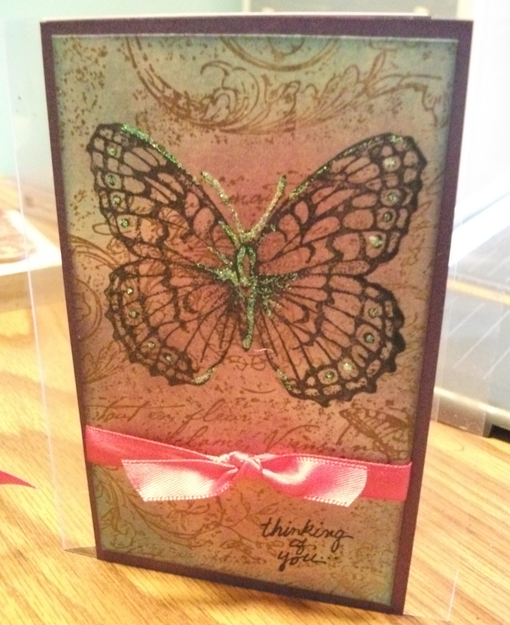
I picked up the most recent issue of CardMaker, featuring a front cover photo and article by Tim Holtz. I was taken by the beautiful technique of the card on th front - typical beauty created by Tim Holtz!! His card inspired me to pull out my Distress Inks from Ranger and create, what I originally thought of as a beautiful card.


The distress technique, learned from Wendy Veach from Stampers Anonymous 490, was nice with the additional pop of the color from the ribbon, but from second glance, it appears to be too plain.

I know I have this problem all the time, which is why I don't post as much as I like - and knowing that I am my own worst critic, I couldn't bring myself to post this card until I improve the color, or background, or the over all appearance of the card.

Happy to say I did just that!!  After taking a second look at the card - which I had intended to send my mother for mother's day, I KNEW I could do better!

So my second card was that much better!

I used the same elements on this card...just enhanced its appearance with more color, gave a pop to the background and accentuated the color better!!

The second card is attached to acetate, because I couldn't decide what to put it on AND I didn't want to take away from the stamped background of the the card.

Happily I will send this card to MOM for mother's day - and although she'll say "you didn't have to do that," I know she will be proud to have received such a well thought out card!!

I hope everyone's been thinking of the card they want to send their MOM for Mother's Day, and I hope all of your cards are as well received as they want them to be!

Stay inspired and keep creating!

Roseanne

supplies:
Stamps:  Stampin' Up Stampin' Around Jumbo Wheel Very Vintage, SU! Stipple Butterfly, Stampendous Thinking of You...
Paper:  the PaperCut Violette Curious Metallic, Art Gone Wild Acetate Sheets
Ink:  Memento Tuxedo Black, Archival Ink Coffee, Tim Holtz Ranger Distress Ink dusty concord, worn lipstick, broken china
Accessories:  Generic Hot pink ribbon, Crystal Stickles


Thursday, April 19, 2012

As promised!

As promised, the third of 3 scrapbook layouts!

Scrapbooking with a purpose is essential in getting the job done!  I am glad I bought these three frames...if for no other reason than to keep me going!!

This layout features the t-ball talents of my oldest.  It, of course features his natural swinging ability and base running.  Whether they are pros or still learning, nothing brings a bigger smile to a childs face than a layout that features him or her doing something they're proud of!!

This layout was extremely simple.  I used a paper pack from Close to My Heart - this gave me the ability to have ready matched paper.  I made the base balls by punching circles and adding the faux stitching with marker.  I distressed the balls and the title to age the look a little and to help pop-up the balls...which were adhered with foam tape.  Just a small touch of journaling and an 'All Star' rub on and done!! 

This layout shows how simple photos and embellishments go a long way!!

Thanks for looking!

stay inspired!

Roseanne